Dolori Clinic 🩻

🚫 Unused identity.
Dolori is a pain treatment center in São Paulo. Before launching, they came to Foresti Design to create their identity. The customer had one thing clear- he wanted to
use green.


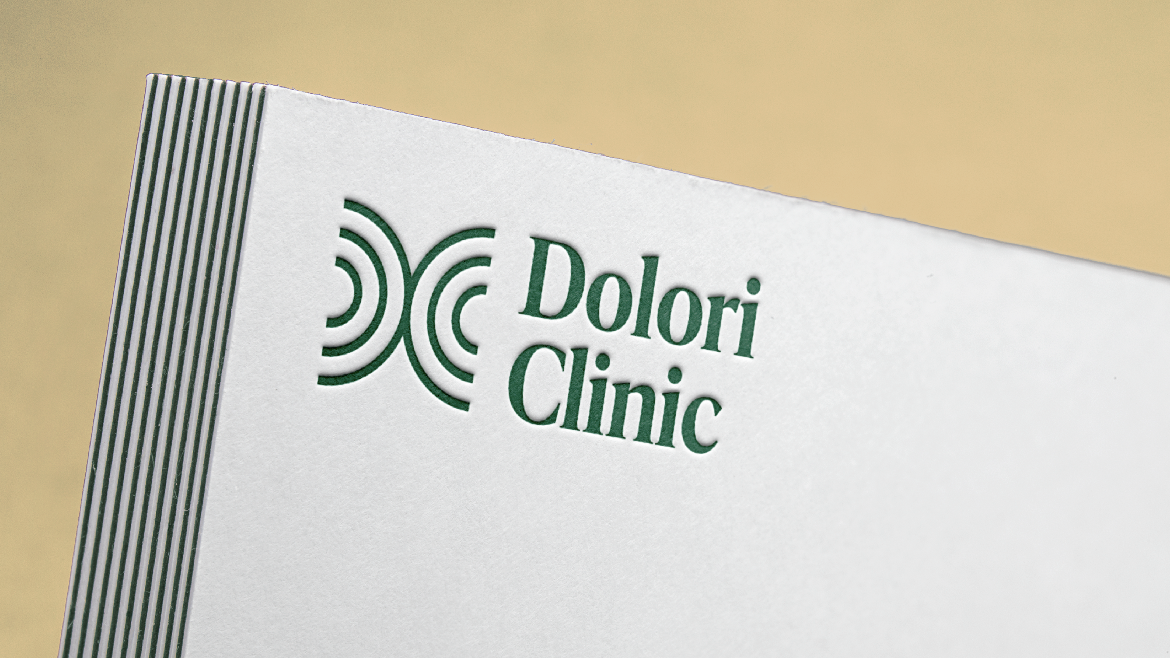
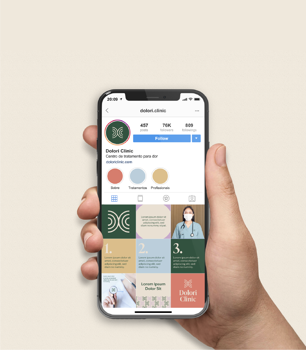
My proposal used a forest green as the main color. The symbol is an abstract version of DC, so abstract that you can make what you want of it (a butterfly meaning renewal, two joints coming together, radiation...) but not so abstract that you can't see the letters.
The rest of the palette complements the green in a colorful but still sophisticated way. The abstract icon makes for great patterns when repeated.


